Here we are with the very first Missed the Train Staff Picks blog post of 2016. The crew at LOOKSLIKEFILM loves gathering these images each week to share with you all. It always amazes us the amount of talent that you guys produce each and every week. Keep pushing the limits in 2016!!!!
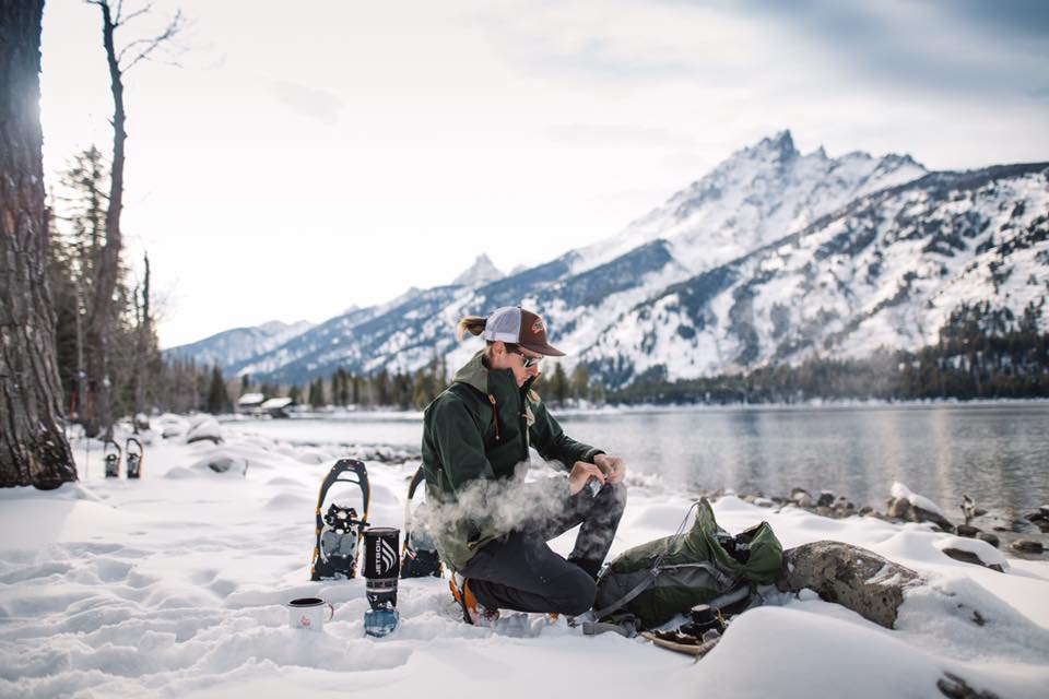
Ben Matthews - Kodak Portra 400-
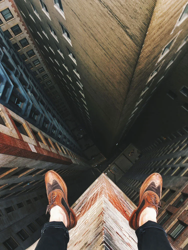
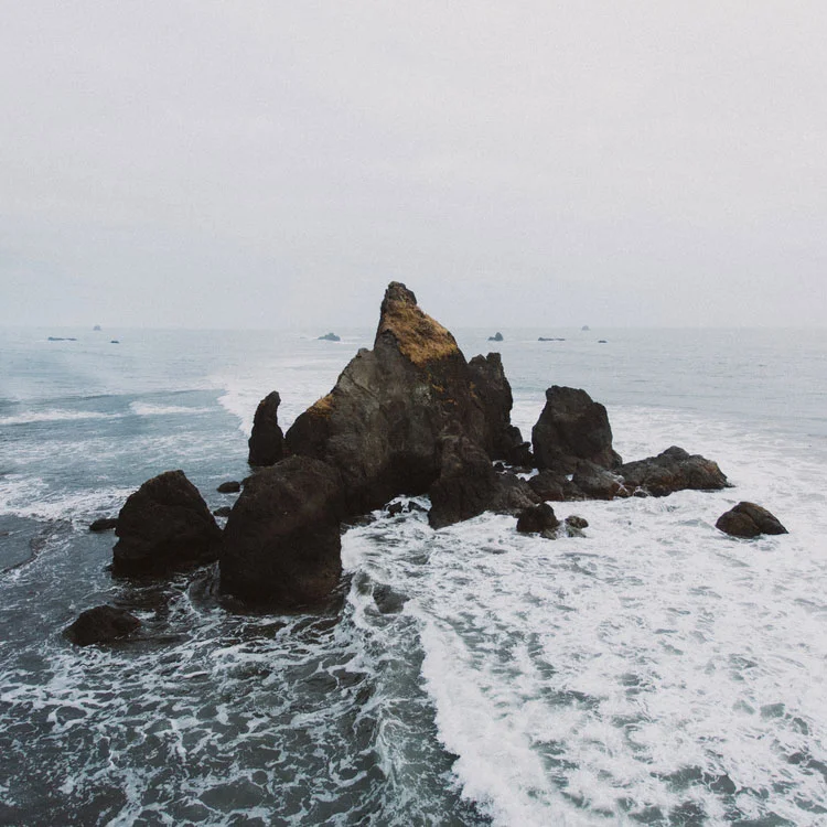
The whole image screams freedom, silence and beauty to me. The wide angle is the perfect choice here. I immediatly wanted to be there. To feel the cold wind. Smell the sea and just relax in between these beautiful landscape. - Sven Malojlo
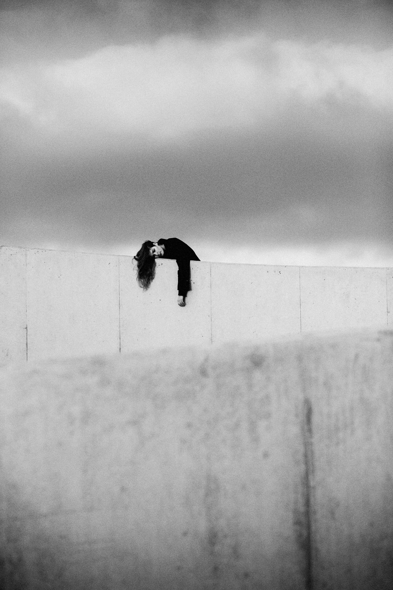
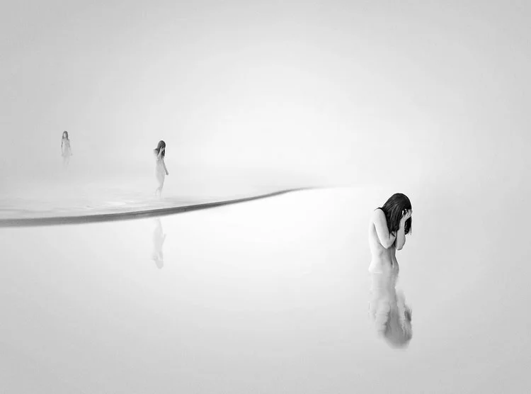
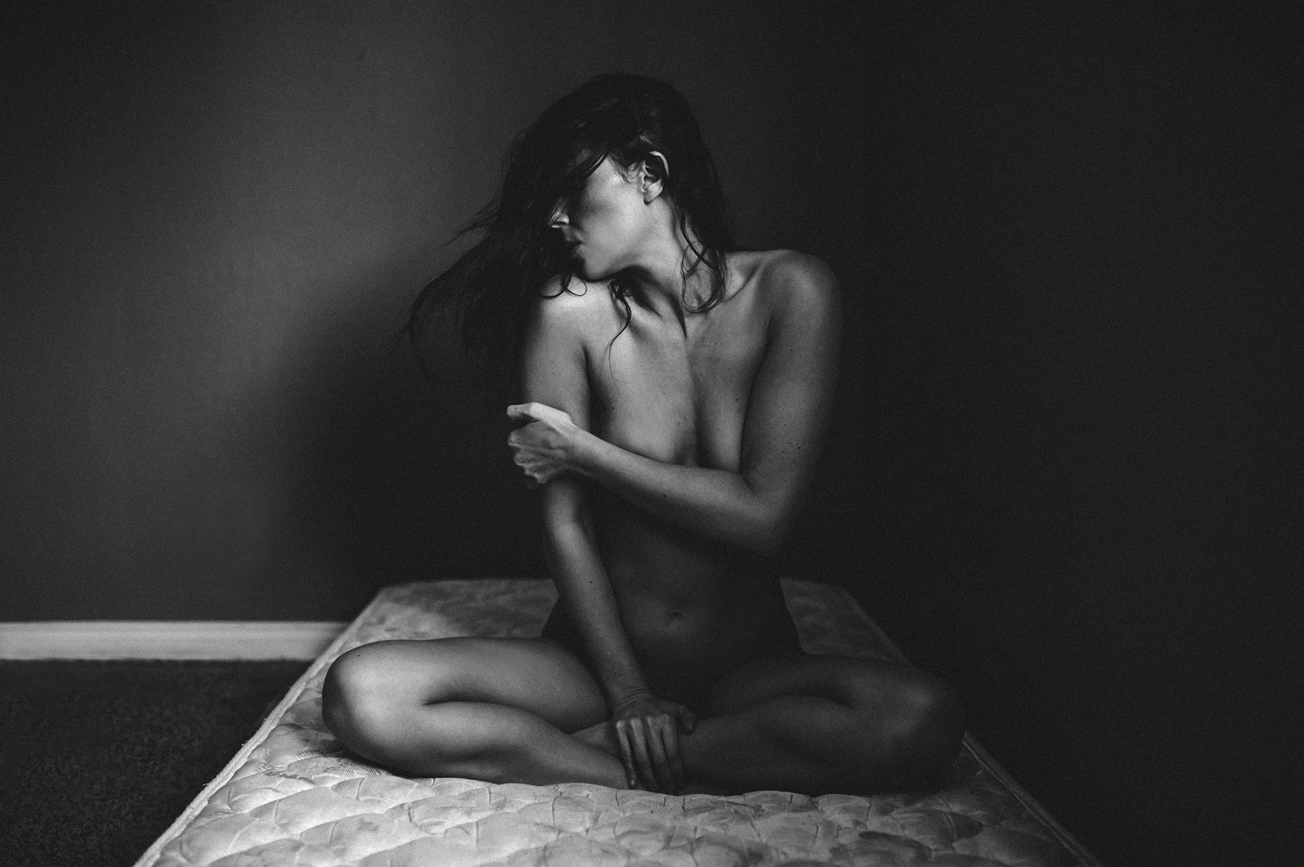
Bjorn Lexius - Tri-X
I love the way she is in stark contrast to the gradient of the sky and wall. The choice of black and white was on point and added to the feeling of isolation and melancholy. - Titilola Samuel
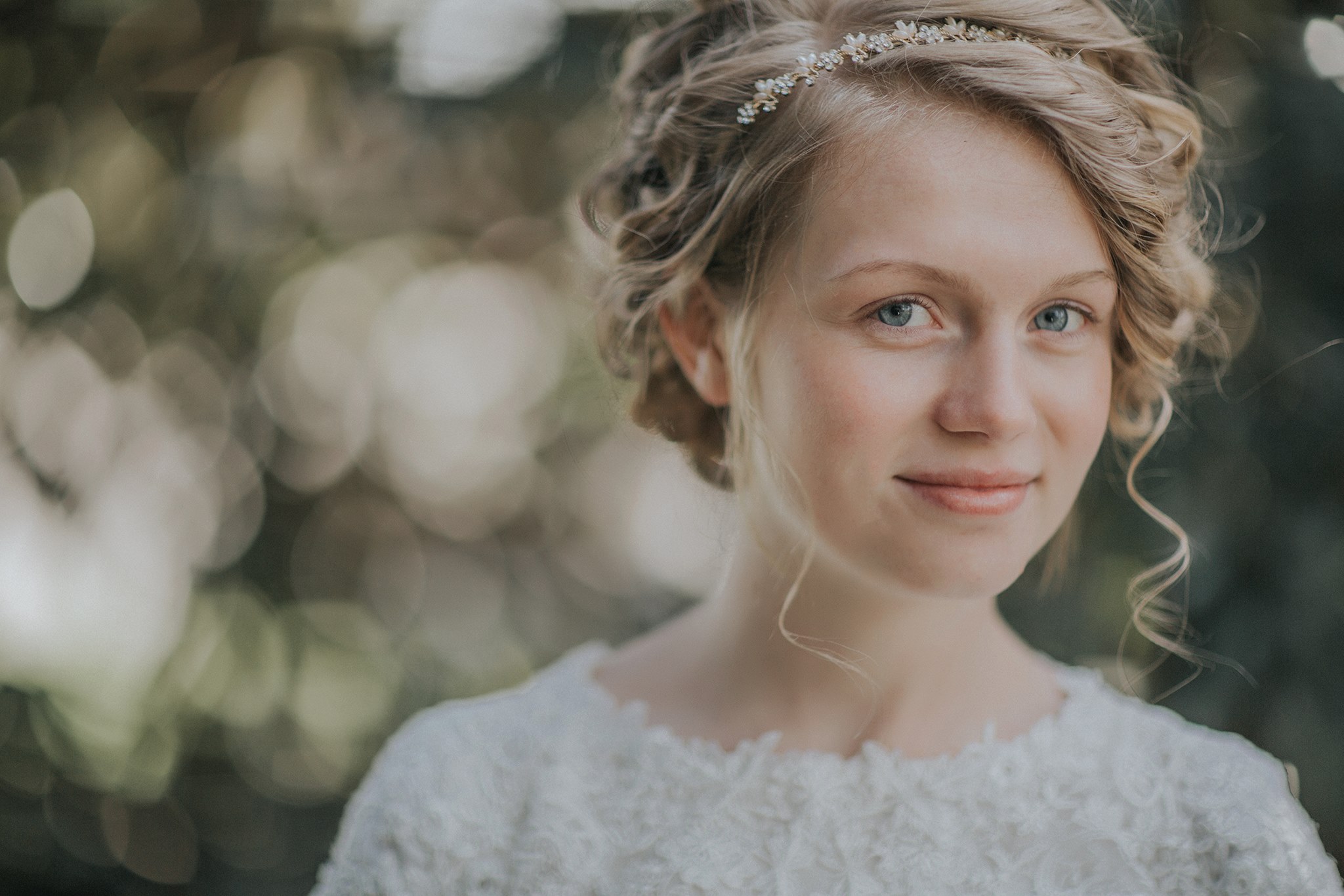
Brandy Lynn - Tribe Archipelago LXC03
https://www.facebook.com/brandy.lynn.750?fref=photo
The expression and composition are fantastic here. I love the soft light in this portrait and the versatility of the Tribe Archipelago presets. LXC 03 is a favorite of mine and many others and it's so fun to see the different ways it can transform images - Jarrett Hucks
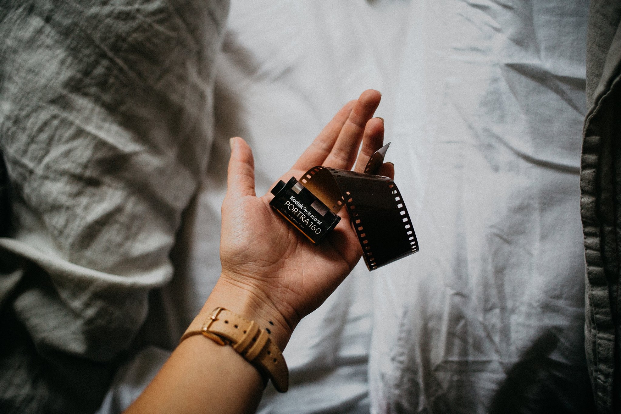
Brooke Brady - Portra 160
http://www.brookebradyphotography.com
Super simple, super nice! - Chris Parkinson
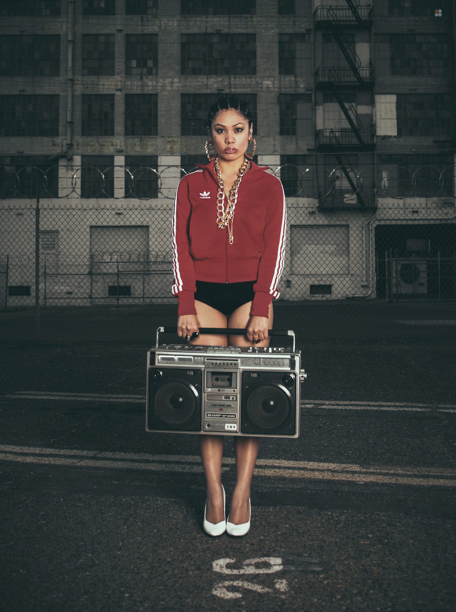
Jeremy Scott - Fuji FP 100c++
http://www.jeremyscottphoto.com
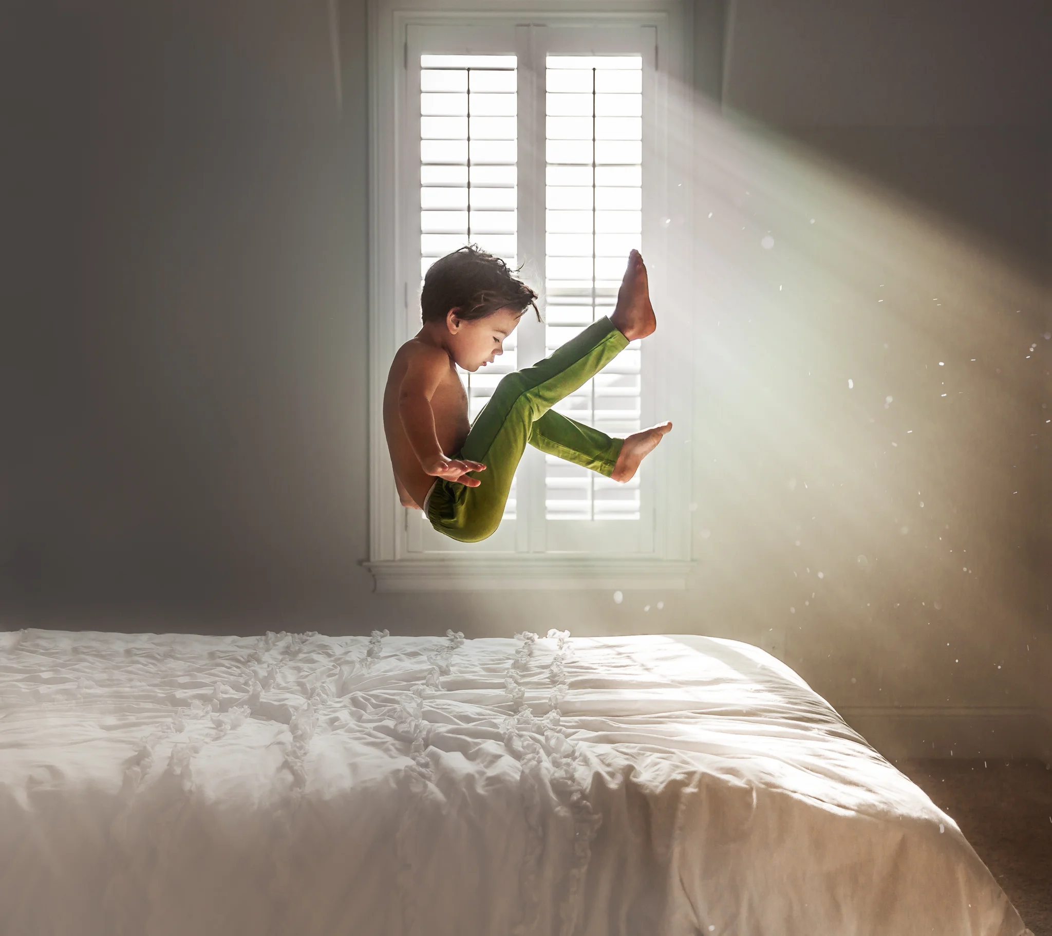
This photo is just a brilliant use of off camera lighting, styling, and expression. It looks like an editorial piece or an advertisement for a brand. It's just very well done portrait all around. Great work. - Jacob Loafman
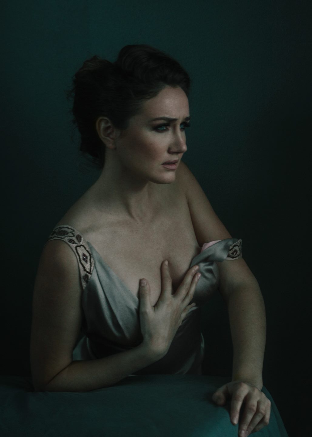
Joel Bedford - Fuji 800Z++
This is one of the very first images that caught my eye while browsing in the groups. I saved it but thought it'd definitely get featured. I'm actually surprised it "missed the train." It's just a stunning portrait! - Max Oishi
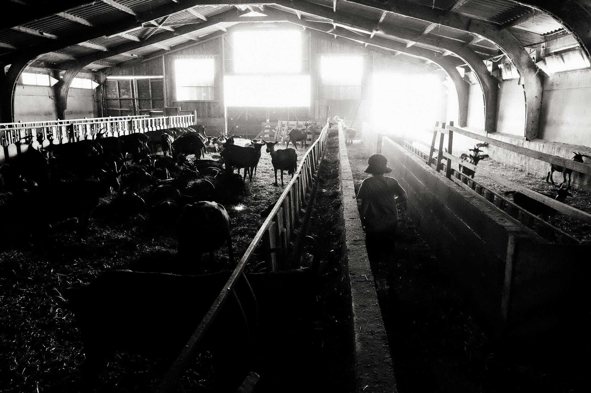
Lea Lebrun Jones - Mastin Labs
I love this image. Such an unlikely place to play. But who is playing? The goats? Or the kids? Are the goats being raised in this farm, or the children? The children probably love playing here, but do they know the fate of those goats?
I love the center leading line which bring your eyes down to the vanishing point where you can see more children playing. The juxtaposition of the foreground being dark and in shadows and the background being light and bright. This entire images screams fine art. - Ari Dorfman

Liam Warton - Fuji Superia 200
I'm a sucker for symmetry so I totally adore this shot. It's different and that makes it very fascinating for myself. Liam always delivers superb and very creative work and I think this image missed the train and needs to be seen! - Lukas Piatek
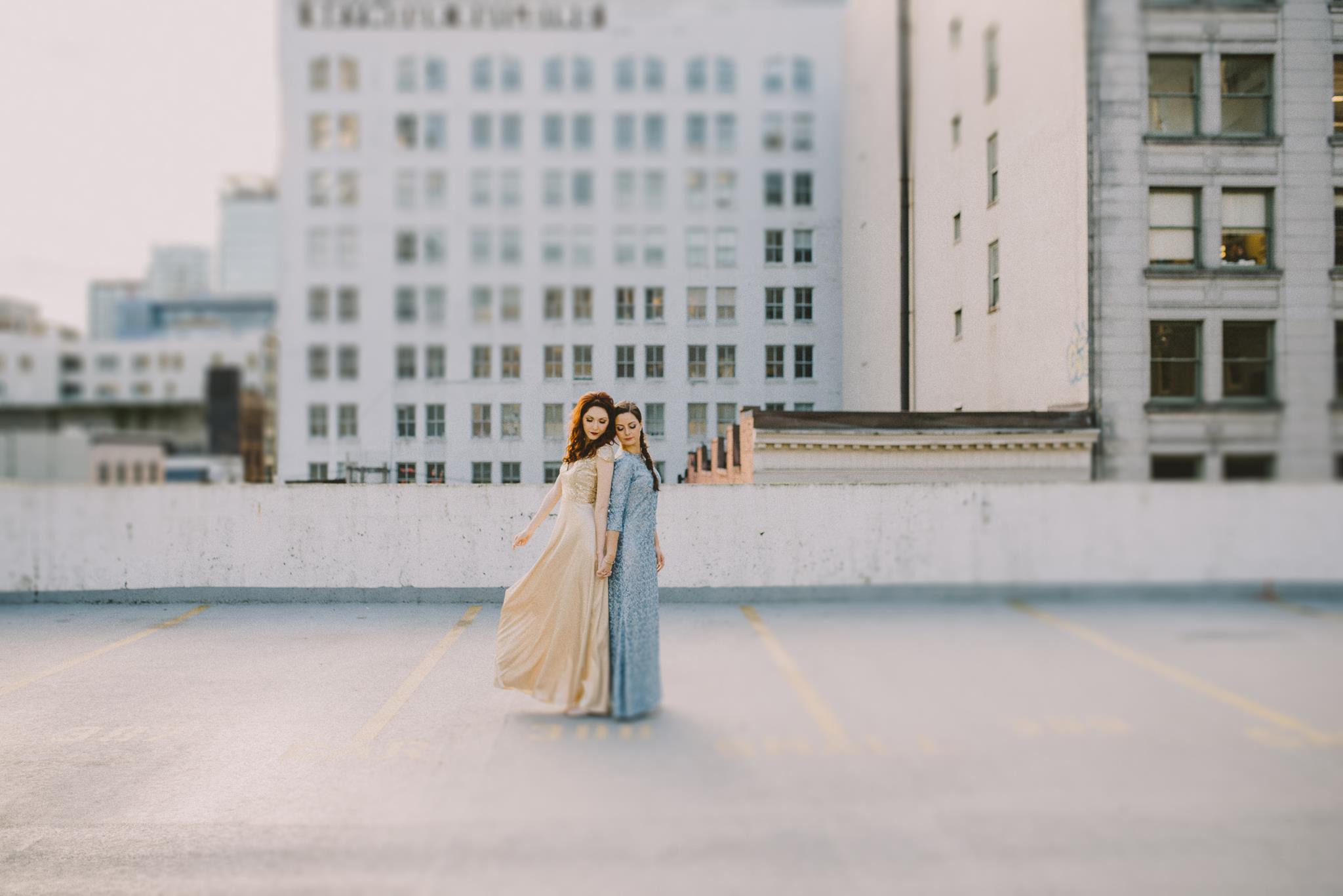
Sara Rogers - Fuji 400H+1-
http://www.sararogers-photography.com
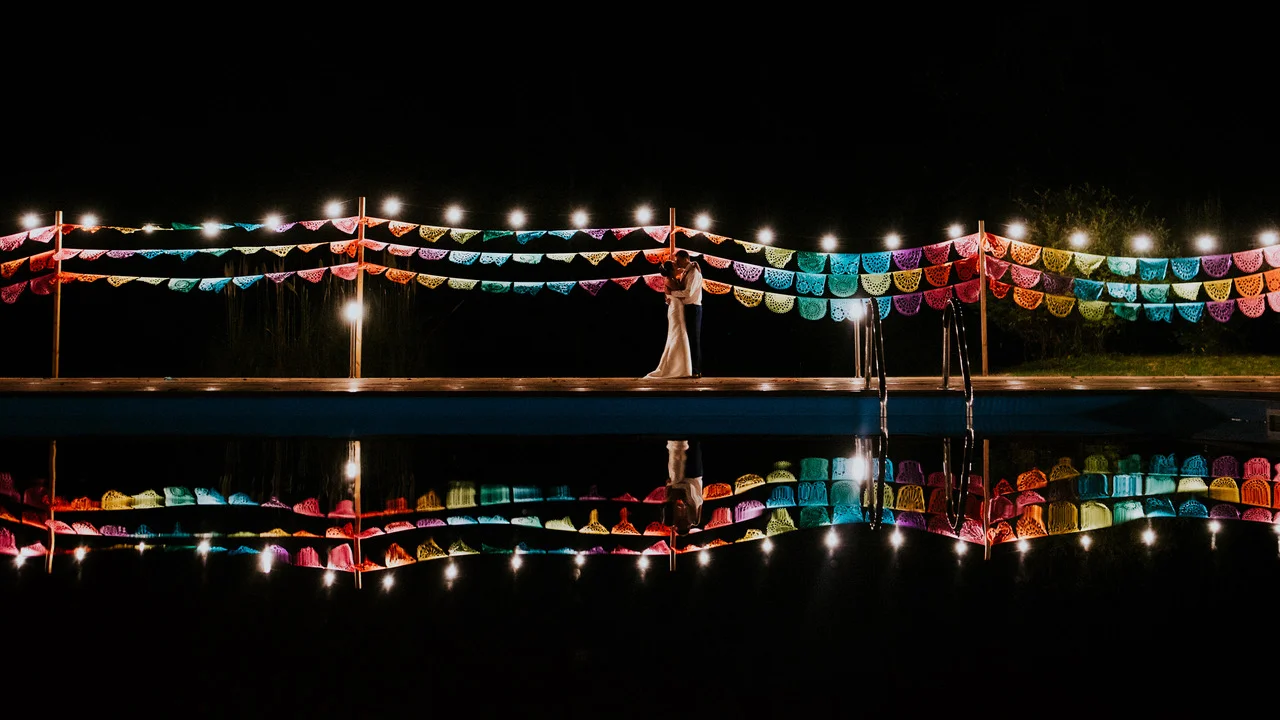
I love the tones, the mood, the setting and the dresses. The tilt shift really draws my eyes into the subjects and adds a lot to the image. I can't wait to see more from this wedding! - Rachel Kaye
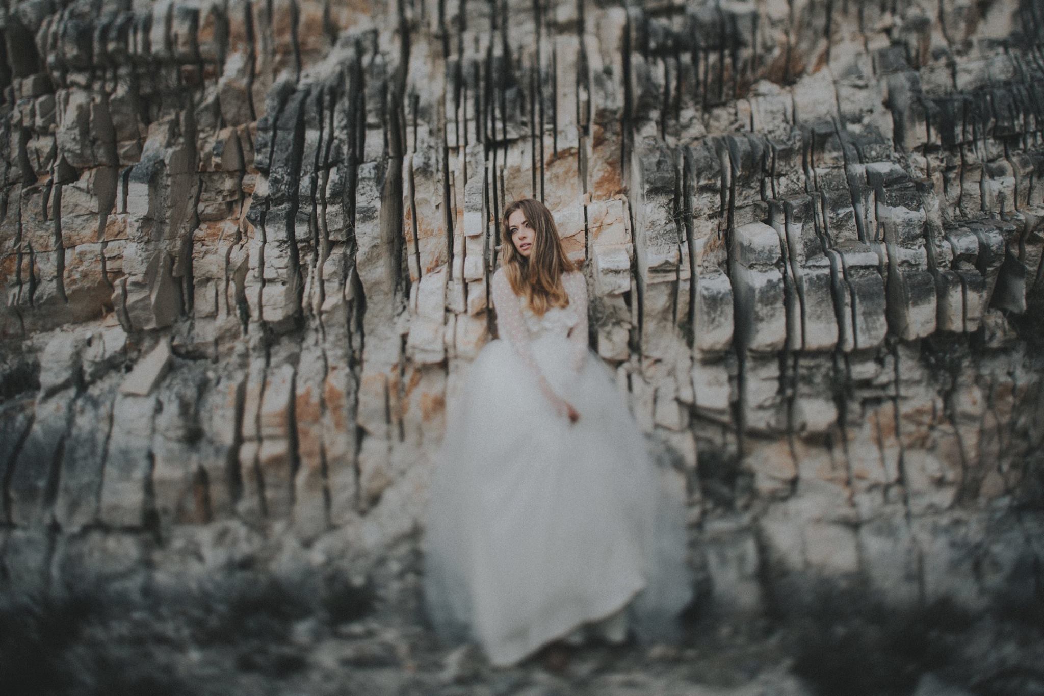
Sean Flanigan - ASE Fuji Reala
http://www.afistfullofbolts.com
The delicate bride against such a harsh rocky background is such a striking contrast and what initially drew me to this image. I then made the image bigger and took a closer look and absolutely love her powerful expression. A brilliant image made perfect by the use of tilt shift and a signature edit by Sean. - Amy-Leigh Atkins
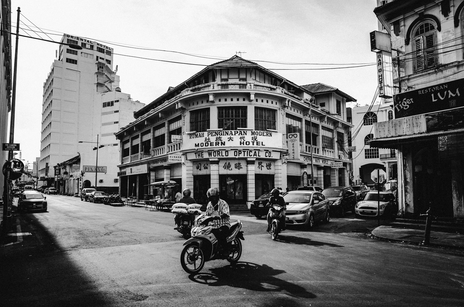
Tim Skirven - Tri-X
Growing up in Southeast Asia, this image resonated with me - my guess is the author was visiting older parts of Malaysia perhaps and captured its daily life. It’s interesting to see the vintage architecture from the colonial days, set against some more modern buildings in the background - some of these businesses are probably passed down through the generations (judging from the fonts on the shop front). I love how the author chose to make this a black and white image with appropriate use of grey tones which accentuate the energy and life - with a journalistic approach to it. It’s not easy to capture these towns as there’s nothing really stylish or aesthetic about them, however this image has been beautifully executed. - Julianna Koh Blackwell


